 Many of us are (closet?) weather watchers – not just to see whether tomorrow will be a good day to garden or sail, but fascinated by patterns, extreme events, short- and long-term trends. In this essay, Grace and Emily describe a key set of sensors at FHL that monitor the natural world – in this case not in the ocean, but on land. These data are both fun to check out and useful to a variety of scientists and non-scientists alike. We are becoming increasingly aware of how land-weather can affect conditions for marine organisms, for example hot days that kill plants and animals in the intertidal zone, in parallel with how water-weather conditions affect the shallow subtidal zone, e.g. when pulses of Fraser River water lower the salinity in our surface waters. It takes work to maintain sensors and data quality, but the weather station provides a great training ground for students. So does the FHL Ocean Observatory, which monitors conditions below the surface.
Reelin’ in the Years at the FHL Weather Station
by Grace Leuchtenberger and Emily Carrington
Emily Carrington (ecarring@uw.edu) is a Professor of Biology, resident scientist at FHL and a lifelong weather enthusiast. Grace Leuchtenberger (sgleuch@uw.edu) served as a research technician in Emily’s lab in spring/summer 2022, supported by NSF and FHL’s Beatrice Crosby Booth Endowed Scholarship, just before entering the doctoral program in the UW Department of Biology. You can expect to read a Tide Bite about her own research soon!
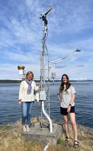
Standing stalwart out on Cantilever Point by the apartments, FHL’s Weather Station (FHLWS) has been recording wind speed, light, temperature, humidity, and rainfall since 2006. While facing some bumps along the way – including a lightning strike – the station has now recorded over 17 years of nearly continuous data. From this labor of love, we can begin to understand what exactly our aerial climate has been doing over the past two decades and how that matches up with our own perceptions about the weather here.
First, a bit about the history of the station (Figure 1). It was one of the first projects Emily initiated when she came to FHL in 2005, with the goal of establishing long-term monitoring of environmental data needed for her own research (biophysical modelling, ecological physiology and behavior), and to support the interests of other FHL researchers as well as the broader scientific community and public. The FHL maintenance crew set the concrete pad for the tower, and Emily and her lab tech (at the time) Gretchen Moeser instrumented it with a suite of sensors to measure wind speed and direction, air temperature, relative humidity, rainfall and light (both PAR, or Photosynthetically Active Radiation, and Energy Flux). Each sensor connects to a datalogger that samples data every 30 seconds and stores 15-minute averages. The data are streamed to a local server and can be visualized in near real-time on the FHL weather station website and NANOOS Visualization System (NVS) of the Northwest Association of Networked Ocean Observing Systems. The data are periodically screened for gaps and errors before landing in their final resting place at bco-dmo.org, the data management office for National Science Foundation (NSF) awards (in this case, OCE-0824903). To keep the data rolling in over the years, Emily has relied on the skilled support of FHL IT (Craig Staude, Alan Cairns, Dylan Crosby) and several talented lab technicians (Gretchen Moeser, Carrie Craig, Matt George, Molly Roberts, and Grace).
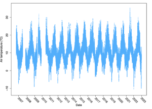
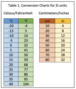
Now, a scientist’s favorite part: the data. Outside of some data gaps, there was a relatively normal cycling of temperature with the seasons, with cold valleys in winter and high peaks in the summer (Figure 2). The winters of 2009, 2021, and 2022 were exceptionally cold, with at least a couple frozen days down to -8 to -10°C (14°F; Table 1) in those years. The summer of 2021 was also unusually hot, getting up to 36°C (97°F) during the Pacific Northwest Heat Dome. Interestingly, summer 2015 was not particularly hot, even though “the Blob” was parked in our part of the Pacific and El Niño was in full swing. Winter 2015-2016 was warm though, possibly an effect of warmer offshore water.
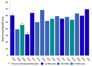
Where does annual rainfall stack up (Figure 3)? Annual rainfall is measured in “water years,” which is the state’s way of keeping the rainy and dry seasons together in annual assessments. This is helpful for agriculture, science, and anything else that looks at seasonal water trends. That means the 2007 Washington water year was from October 2006 to September 2007, not January to December 2007. Another piece of important context for Figure 3: in the legend, you can see squares that refer to “La Niña” and “El Niño.” These are both cyclical climate events that make up the ENSO (El Niño Southern Oscillation) climate pattern that recurs every few years. In the Pacific Northwest, El Niño generally causes warmer, drier springs and summers, while La Niña makes those seasons cooler and wetter. However, we can see that non-ENSO years still had some of the most extreme precipitation patterns, with 2008 being the driest and 2013 being almost as wet as 2022. While 2010 looks to be the driest on this list, there were about six months of data missing from January to June (due to repair from that lightning strike) and as any true PNW resident knows, most of the year’s rain was during that time.
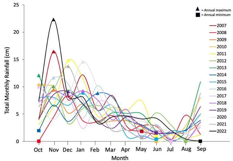
Those monthly patterns are more apparent in Figure 4. While there’s plenty of variation between years, most yearly rain fell between September and April, with a big dry period in the summer. Year-round and summer residents alike can see this “Mediterranean climate” pattern when all the hills turn golden in July and August.
Besides water years, another form of meteorological fancy footwork is wind chill calculations (Figure 5). Wind chill, or the “feels like” section on the phone weather app you angrily check in winter if you live around here, uses wind speed and temperature to calculate how much heat you’re losing from your body and in turn, how that feels as a temperature. Different countries have different equations for wind chill. In the U.S., the wind chill correction is only applied to temperatures < 10°C/50°F; above that temperature, wind chill and air temperature are the same value.
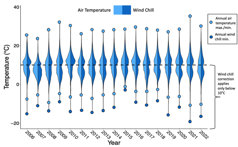
Wind chill distributions are visibly lower than just regular air temperature, with the annual minimum in 2021 clocking in at -19°C. Meanwhile, the minimum air temperature for 2021 was around -11°C, or balmily above zero at 12°F. Brrrr! 2021 also had the highest temperature of any year, with a maximum at 35°C, and the broadest range of 54°C, or almost a 100°F swing. 2015 had the mildest winter of the whole dataset, temperature-wise.
 From all these graphs, it’s hard to see any directional change in climate from 2006-2021. Yet, you see hints of it: the crazy variance in temperature in 2021, and the mild winter from the Blob. With over 17 years of data, we are on our way to establishing a solid source of climate data for the decades to come. It’s important for climate change monitoring and action, but it’s also a way to pursue knowledge that’s widely shareable and understandable: a line connecting the peculiar pursuits of academic science to the experience of everyday life. To that point, this resource has been used not just by FHL researchers and classes, but by a local pilot in town who likes to check the wind, and NOAA researchers set up some instruments at Cantilever Point too! It’s a privilege to pursue such a goal and to share the joy with others, hence why we are writing here about particulars of violin plots, water years, and ENSO, hopefully to nobody’s chagrin.